Shadcn Examples
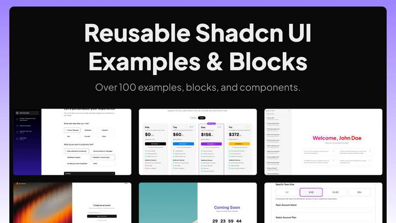
Shadcn Examples offers a collection of reusable React and Tailwind UI components and templates for building web apps efficiently.
product Details
Explore More
Alternatives
About Shadcn Examples
Shadcn Examples is a robust library specifically designed to enhance the experience of developers using the shadcn/ui library. It provides a comprehensive collection of pre-built UI components and templates that can be easily integrated into applications. Aimed at developers, designers, and product teams, Shadcn Examples bridges the gap between component libraries and fully functional UI kits. With its extensive catalog, users can find ready-made solutions for common application needs, such as admin dashboards, marketing sections, and various web app layouts. The main value proposition lies in its ability to save time and effort by offering copy-pasteable components built with React, Tailwind CSS, and Radix UI, allowing developers to focus on building unique features rather than assembling basic layouts from scratch.
Features
Extensive Component Library
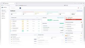
Shadcn Examples boasts a wide range of reusable components and templates that cover various application needs. This library includes everything from admin dashboards to marketing sections, all built with modern technologies like React, Tailwind CSS, and Radix UI.
Live Preview Functionality
The platform offers a live preview feature that allows developers to see how components and templates look and function in real time. This feature is essential for ensuring that the chosen designs meet the specific requirements before integration into projects.
Compatibility Across Frameworks
The examples provided are not limited to a single framework. Shadcn Examples supports integration with popular frameworks like Next.js, Vue.js, and Svelte, alongside TypeScript compatibility, making it versatile for different development environments.
Regular Updates and New Additions
The catalog of Shadcn Examples is continually updated with new components and templates. This steady release cadence ensures that developers always have access to the latest design trends and functional enhancements, keeping their projects modern and relevant.
Use Cases
Rapid Prototyping for Startups
Startups can utilize Shadcn Examples to quickly prototype their applications by leveraging pre-built components. This accelerates the development process, allowing teams to focus on validating their ideas without getting bogged down by UI design.
Internal Tool Development
Companies building internal tools can benefit from the wide range of admin dashboard templates and layouts. Shadcn Examples simplifies the process of creating user-friendly interfaces for managing data and team workflows.
E-commerce Solutions
E-commerce developers can use Shadcn Examples to create visually appealing and functional online stores. The available templates for product listing, cart management, and checkout flows streamline the development of user-friendly shopping experiences.
Educational Applications
Educational institutions can leverage Shadcn Examples for building interactive learning platforms. The library includes templates suitable for student dashboards, course management, and communication tools, making it easier to deploy educational resources online.
Frequently Asked Questions
What is Shadcn Examples?
Shadcn Examples is a library of pre-built UI components and templates designed to complement the shadcn/ui library. It helps developers create fully functional applications more efficiently.
How do I access the components?
Users can browse and access various components on the Shadcn Examples website. Many components are available for free, and users can run them through a live preview before integrating them into their projects.
Is Shadcn Examples compatible with other frameworks?
Yes, Shadcn Examples supports multiple frameworks, including React, Next.js, Vue.js, and Svelte. It also offers TypeScript compatibility, making it versatile for different development environments.
Are there regular updates to the library?
Absolutely. Shadcn Examples is regularly updated with new components and templates to ensure that users have access to the latest designs and functionalities, keeping their projects modern and relevant.
Similar to Shadcn Examples
Polymarket Trading Bot For Crypto
Polymarket Trading Bot For Crypto